Last updated on March 13th, 2023 at 03:50 pm
The psychology of colors and emotions is one of the most controversial aspects of marketing. Color affecting moods and behavior is a well-known fact, and it can impact a consumers perception of a product or brand based on things such as personal experiences, cultural differences, and personal preferences, which may vary from person to person. These experiences and preferences impact the way people perceive things, including colors. In short, the way one person reacts to a color may be very different from how another person reacts to a color, though in most cases they remain fairly similar. With that in mind, color is still the key visual component that people remember most when they see something and the colors you choose to use should not be overlooked.
What is color psychology?
Color psychology is the study of colors in relation to human behavior. It deals with questions like “what colors make people happy?” or “how do colors affect moods?”
The goal of this study is to determine how colors colors affect moods, such as happiness, anxiety, or sadness. It also tackles how people interpret colors and their emotions’ influence on a consumer’s day to day feelings and decisions, such as purchasing a product. For example, a factor as small and seemingly simple as the color of a product or branding may compel or discourage someone from a purchase or cause someone to choose one brand over another.

Not only does every color have a different meaning, but this meaning could be different from one person to another depending on a person’s upbringing, values, location and many other factors.
Culture plays a very big part in color associations as well. If you’re planning on taking your marketing strategy international, it can be risky to expand to a new country and not consider how color interacts with the local culture.
For example, Pepsi made a crucial mistake when it expanded to the Southeast Asian market. The company colored its vending machines light blue, which seems innocent enough. But what they didn’t know was that it was culturally associated with death in that region. As a result, their sales took a huge hit.
There are other cultural cues for color that brands need to recognize and change. For instance, white is often associated with purity and innocence. But in some cultures like Japan, it symbolizes death. Likewise, red insinuates danger in the Western world but in China, it’s considered a lucky color.
With the right combination of colors and emotions, you can influence how someone feels, thinks and behaves. How do you want someone to feel when they look at your product or branding? Find a corresponding color that is known to evoke those specific feelings. Keeping psychology, effect of color and purchasing practices in mind will help you narrow down the right color palette for your marketing goals.
Color psychology in marketing
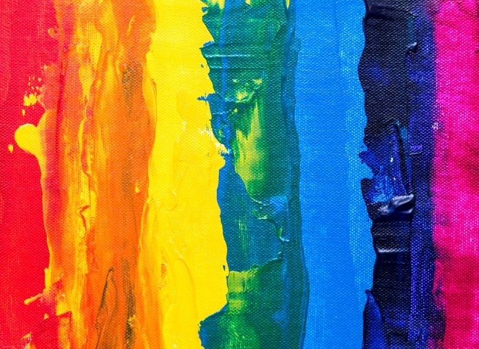
There are two types of colors on the color wheel, warm colors and cool colors. Warm colors, such as reds, oranges, and yellows are ideal for creating energy and emotional intensity in your designs. So what are happy colors? Generally, they consist of mostly warm colors.
Cool colors, such as blues, greens, pinks and purples are best for creating a design that is more calming and soothing. Color psychology is an important factor when it comes to branding as it helps boost brand awareness with instant recognition. Some of the most recognizable brands in the world rely on the colors used in their logos to help with recognition. Color increases brand recognition by up to 80%.
Color in Marketing Statistics
The effect of colors and emotions in marketing isn’t just theory. It’s effective in practice as well, with plenty of studies and facts to back it up. Here are a few stats to prove it.
A study by the University of Winnipeg confirmed just how vital colors and emotions are at establishing first impressions. It revealed that consumers create an opinion of a product within a minute and a half of seeing it. And as much as 90% of that feeling is based on the product’s color.
People are generally visual creatures, and that translates to how they buy products as well. Regardless of functionality, consumers base 93% of their buying decision on the look of the product – and the color is a big part of that. That’s a significantly larger hold over texture (at just 6%) and sound or smell (at 1%).
You may think that different people having different preferences (or a favorite color) could cause problems when deciding on color in marketing. While you can’t match everyone’s personal tastes, people tend to gravitate towards the same colors. You can use statistics to find colors that most people like and use that in your marketing.
For instance, a 2003 research project showed that blue is everyone’s top color, regardless of gender. As per the respondent, it was the favorite of 57% of men and 35% of women.
As for the second favorite color, men and women are split on their responses. For men, it’s red (at 8% of respondents), while it’s purple for women (23% of respondents).
Green is also a well-liked color, with 14% of either gender expressing a fondness for it.
At the other end of the spectrum, the least liked color by far is orange, with 29% of respondents saying so. The second-to-worst place is brown, with 23% of people disliking it.
Red color psychology
Red is often associated with blood or fire and can represent both warmth and danger. When it comes to branding, red can be used to represent passion, power, confidence and strength. Red also attracts more attention than any other color and is often used to signify danger. This is one of the more dynamic colors as it is widely associated with both positive emotions, such as love and passion, and negative emotions such as danger or fear.
Notable brands that use red: McDonald’s, Redbull and Coca-Cola.
Orange color psychology
Orange is considered an energetic color that evokes feelings of warmth, excitement and enthusiasm. The color orange tends to be a positive and optimistic color and encourages people to look on the bright side of things. Similar to red, orange can evoke feelings of passion though not nearly as aggressively as red does.
However, a study shows that 26% of respondents correlate orange with cheap products. So if you’re planning to use this color, you may need to compensate for this association.
Notable brands that use orange: Discover, Harley Davidson and Amazon.
Yellow color psychology
Yellow is best known to make people feel happy and optimistic. It is the color of the sun afterall, and the sun is the bright and warm center of the universe, you can’t get much more positive than that. Yellow is believed to have an influence on the left side of the brain, which is where deep thinking and perception occurs.
Notable brands that use yellow: Snapchat, Nikon and Ferrari.
Green color psychology
Green is mother nature’s color and most often symbolizes growth and renewal and evokes feelings of a calming nature. Though green promotes positive feelings such as safety, compassion, and tranquility, it also symbolizes negative emotions such as jealousy.
Notable brands that use green: John Deer, Spotify and Starbucks.
Blue color psychology
Similar to green, blue is most often associated with peace, tranquility, and is often used to promote feelings of trust and dependability. Blue is also often associated with intelligence, as research has shown that this color helps stimulate thought and enhance concentration. Like most colors, blue also comes with negative connotations. It’s considered one of the “sad colors” (this is where the term “feeling blue” came from), and also creates feelings of coolness or aloofness.
Notable brands that use blue: Facebook, Geico, and American Express.
Purple color psychology
Creativity, wisdom, power, and magic are often associated with purple. Purple is achieved by mixing blue and red, giving it the perfect mix of energy and intensity (from the red hues) and relaxation and stability (from the blue hues.) Purple can also convey feelings of snobbery and inferiority.
Notable brands that use purple: Instagram, Yahoo and Hallmark.
Pink color psychology
Pink is a calming and non-threatening color often associated with love, kindness, femininity, calmness and innocence. It is also associated with weakness, vulnerability, and shallowness. Pink works to reduce feelings of resentment, anger and irritability.
Notable brands that use pink: Dunkin’ Donuts, T Mobile and Lyft.
Black color psychology
Black is often associated with sophistication and power, as well as death or evil. However, black can be used in a variety of ways, all dependent on context, though can be overwhelming if used too frequently. Black can be a difficult color to incorporate in marketing strategies considering it is one extreme end of the color spectrum and technically not a color at all, but an absence of color.
However, black does have its advantages. A study reveals that 42% of its respondents associated the color with high-quality products. It’s a fitting observation, as black exudes a certain kind of elegance and class (think dark suits and dress shoes).
Notable brands that use black: Chanel, Gucci and Nike.
White color psychology
White is linked to feelings of purity, safety and minimalism. Commonly, white space cultivates creativity as it is often perceived as a blank canvas. Similar to black, white can be a difficult color to use in marketing efforts due to the fact that it is on the opposite end of the color spectrum and is composed of all hues on the visible light spectrum.
Notable brands that use white: Apple, Facebook and Samsung.
Colors and printing
Once you have picked the perfect color scheme for your project and are ready to design, you will want to make sure you set your file up to design in the CMYK colorspace to ensure print color accuracy. Designing in the RGB color space may result in a printed design that does not accurately reflect the colors you used on your computer. If you have any questions, contact Printivity’s service department at 1-877-649-5463 or [email protected].


