Last updated on April 10th, 2024 at 04:29 pm
Use Design Psychology For Your Brand
At first glance, buying a product seems like a purely rational process. We look at similar products, compare the quality versus the cost, and then buy the one that appears to offer the best value. This is true to a certain extent. However, psychology in design plays a more significant role in the buying-decision process than most people realize.
It is widely known that branding directly affects the buying decisions people make. What isn’t as well known is the many ways psychological principles affect those decisions. Design psychology has a direct influence on preference-based judgments by affecting certain areas of the brain, such as the prefrontal cortex, midbrain, and hippocampus.
Building trust is one of the primary objectives of a brand, and consumers correlate familiarity with trust. Visuals boost brand familiarity by giving people something they instantly recognize. They see your logo or other visuals used to market your business (brochures, flyers, etc.), and they immediately correlate them with what they know about your brand. Including design psychology in the design process helps ensure they make the correct associations between the visual and what your brand represents.
Three design elements, in particular, have a powerful influence on buying decisions: color, fonts, and shapes. Learning how to start appropriately using these principles of psychology for designers will greatly improve the effectiveness of your brand, your logo, and your marketing materials.

The Psychology of Color
Color affects people in many ways, one of which is being a strong correlation between color and feeling. In fact, studies have shown that color triggers a very specific response in our brains. Knowing this, designers use color, fonts, and images to tap into deep human behavior and emotions.
Color also affects how we understand the world to the point where people recognize colors before letters or shapes. At the same time, color perception can be very subjective and can vary according to age, gender, and culture. For example, some cultures associate white with purity and happiness, while others associate it with sadness and grief.
In general, colors such as red, yellow, and orange are associated with excited emotions. Colors such as blue, violet, and green are associated with calmness, coolness, and tranquility. Colors can play a huge part in user experience.
Mixing different colors in a design will affect humans psychologically. For example, using many bright colors creates a youthful, energetic feeling. At the other end of the spectrum, black and white is a simple but elegant combination that conveys maturity and sophistication.
If the colors you choose don’t fit your business and industry, they probably won’t resonate with your target audience. Before selecting colors to represent your business, consider the message you want to communicate and the feelings you want to evoke. Select a primary quality that defines your business, then use colors that are associated with it.
The Psychology of Fonts
As with color, fonts have a psychological impact on people. They generate different emotions based on the shape of the letters and our responses to those shapes. When selecting a font for your marketing materials, it’s important to choose one with the right personality.
The Software Usability Research Laboratory (SURL) at Wichita State University looked at the traits people associate with different fonts. People who participated in the study characterized traditional fonts such as Arial or Times New Roman as stable and mature. They also saw them as being unimaginative and conformist. Less traditional fonts like Comic Sans were characterized as casual, youthful, and happy.
There are more than a hundred fonts to choose from, but they can all be grouped into one of four primary categories:
- Serif. The short lines coming off the letter edges give Serif fonts a formal, traditional look.
- Sans-serif. Letter edges without short lines create a more casual, playful look.
- Decorative. These informal fonts are considered creative, fun, and, depending on the design, even quirky.
- Handwritten. This category includes fonts that look like handwriting. Formal ones are often used for invitations.
Underscoring the importance of font selection, a study conducted by MIT asked people to compare a print layout designed with poor typography to one using good typography. The study found that the document with the better font took less time to read and led to increased cognitive focus on the content. This suggests that when it comes to your company’s logo and other marketing materials, legibility is critical.
The Psychology of Shapes
If you’re not a designer, shape probably doesn’t show up on your radar screen when it comes to designing marketing materials. Yet, this key element also plays a major role in shaping people’s decisions about your business and your product, especially when it comes to your logo. There are three different categories of shape – geometric, abstract, and organic – each of which is associated with different concepts and qualities.
Geometric shapes

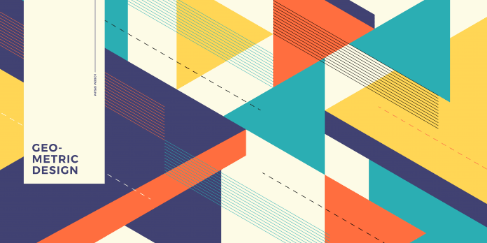
These consist of squares, circles, triangles, and other shapes that rarely occur in nature. Because they appear man-made, geometric shapes convey a sense of order and power.
Qualities associated with squares and rectangles include strength, stability, and reliability. Circles create a sense of harmony and unity. They are also associated with qualities such as softness, gentility, and nurturing.
Triangles are a directional shape; their meaning can change depending on how they are positioned. Triangles that point straight up convey power, stability, and upward momentum. Upside-down triangles suggest instability or downward momentum. Triangles pointing sideways suggest movement in that direction.
Abstract shapes

Also referred to as symbols, abstracts are simplistic shapes that represent something specific in a culture. They communicate clear, common meanings that everyone can immediately understand. Examples include:
- Stars: Can convey patriotism, religion, or show business.
- Hearts: Communicate love, relationships, and marriage.
- Broken hearts: Symbolize divorce, break-ups, and sadness.
- Arrows: Evoke a feeling of movement and travel.
Organic shapes

Organic shapes are based on nature and can range from rocks and leaves to water, clouds, animals, and other organic items. Irregular non-symbolic shapes can also be considered organic, even if they aren’t drawn from nature.
Soft shapes such as leaves, grasses, and water tend to have a relaxing, soothing effect. They are often seen in logos for spas and holistic medical businesses. In contrast, shapes with sharp angles can create feelings of anxiety. Shapes that don’t represent anything recognizable can be interpreted in various ways. Be careful when using them on your logo or other marketing materials.
The Psychology of Logos
Logos are one of the most important elements of your brand and definitely the most important visual element. Create a logo that accurately reflects your brand requires using the three main psychology of design elements. How you integrate colors, fonts, and shapes will determine how people perceive your logo and the message it sends.
To design a great logo for your brand, keep the following in mind:
- Size makes a difference. A larger object attracts more attention and seems more important. This doesn’t mean you need an oversized logo, but the most important element of your logo should be the largest.
- Use negative space carefully. Items surrounded by negative space seem more restful than items in close proximity. However, don’t go overboard with the negative space. Leaving too much can create the perception that your logo lacks unity and coherence.
- Neat and orderly isn’t necessarily best. An orderly arrangement of logo elements communicates formality, conformity, and stability. Irregular placement suggests playfulness, chaos, or rebellion. Your arrangement should align with what your target audience is looking for in your brand.
- Consider your audience. People in Western countries read from left to right. Items on the left side of the logo will be seen first and thus perceived as most important.
Ultimately, every detail of your company’s logo will influence how people perceive and react to it. Making informed decisions about the use of color, fonts, shapes, and overall composition will lead to a logo that resonates with your target audience while inspiring trust and confidence in your brand.


