Last updated on March 2nd, 2022 at 04:27 pm
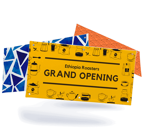
Printed banners offer a very effective way to market your business at an event. Designing and printing a banner on the cheap is relatively easy. They can be placed almost anywhere, and can be used again and again. Most important, well-designed banners attract a lot of attention and deliver messages that tend to stick in the minds of viewers.
Event banner design: getting clear on what you want to accomplish
The first step in event banner or sign design is to get clear on three things:
- The audience
- The purpose of the banner
- The outcome you want to achieve from your banner
Custom banners are most effective at an event designed for a targeted audience. That way you can focus the banner’s message on something that will appeal to customers and potential customers. This can range from announcing a new product to opening a new store, having a sale, special discounts, and more. The primary goal is usually to stoke the sales pipeline with new prospects and/or generate immediate sales.

Custom banners can also work at events with a mixed audience. In that situation, a message designed to raise awareness of your brand or highlight your engagement in the community would be more appropriate. Keep in mind that your event banner design should be consistent with your logo and other marketing in terms of color, messaging, and other visual elements.
Event banner design: creating the right design aesthetic
Aligning your custom banner with your brand doesn’t mean it should look exactly like your other marketing materials. But the design should not make people stop and wonder whether you’re becoming a different brand than the one they know and trust. Understanding design styles can help with this important element and there are many templates you can follow. Some of the most popular include:
- Classic. The classic design is a fairly easy design; nothing overly creative or unusual – just a solid graphic and the company name. The advantage is classic designs have longer staying power than other design types.
- Retro. This typically involves reaching into the past for a certain design style but updating it in ways that fit the current era. Retro is often used when targeting younger audiences.
- Material. An innovative and thoroughly modern technique, material is a “flat” type of design that uses grids, light, and shadow to create the graphics. It is often used by newer companies in the technology and web-based spaces. The Google logo offers a great example.
- Handcrafted. This low-key design style favors logos and graphics that look like they’ve been drawn by hand. This evokes a feeling of authenticity and craftsmanship that works especially well with smaller brands that offer handcrafted products.
- Modern/Minimalist. This design style starts with a bare minimum but offers a lot of room to grow as the business grows. It is frequently used by companies trying to establish their brand rather than enhance an existing one. Apple has used this style to great effect. The minimalistic style can help your company appear more professional.
Event banner design: fonts and colors

Choosing the right font and font size of your banner depends to a large degree on how far away people will be when reading your banner.
- Go big. One rule of thumb says to increase font size by one inch for every 10 feet in distance. Headlines should always be bigger than other copies, which should be kept to a minimum.
- Use contrast. To grab readers’ attention, the text needs to stand out. The traditional approach uses black or grey text on a white ground, which doesn’t rank very high on the excitement meter. A great graphic designer can use color to much greater effect.
- Use a serif font. Serifs are great for event banners because they have more style and make each individual letter distinct. They also allow for more white space between each letter, which makes the copy easier to read. When it comes to large headlines, the difference between serif and sans-serif becomes less important and is often a matter of personal preference.
Good banner messaging.
The final element in good event banner design is the messaging. Your messaging should be:
- Focused. A banner isn’t the tool for telling the world everything about your company. Limit your message to one or two key ideas that people will remember after the event.
- Readable. Use minimal copy, with the right size font for the venue and plenty of white space to make the copy easy to read. A bold font will also help the printed message stand out and be easier to read from afar.
- High-quality graphics. Pictures and graphics get viewers’ attention, so they need to be of good quality. Otherwise, they will weaken the banner’s message and cause people not to read it.
- Use bold, bright colors. These are also important for attracting attention and helping your banner stand out from others. Make sure the colors align with your brand and will evoke the emotions you want from the audience.
Learn more about how to make your business stand out at an event. Once you’re ready to order your banner, receive an instant quote from Printivity! If you have any questions, contact our customer service department at 1-877-649-5463 or service@printivity.com.
